I've looked at Pop From Both Sides Now. . .
James Rosenquist, A Leaky Ride for Dr. Leaky, oil on canvas, 78" x 198", 1983. Courtesy of SF MOMA
The painter James Rosenquist died last month. I’ve become reacquainted with his work this year thanks to SFMOMA. I serve as a tour guide a few times a month there and every so often I often find myself sitting on the gallery floor with a bunch of elementary school kids in front of Rosenquist’s massive painting A Leaky Ride for Dr. Leaky. The painting is a bold mix of images and colors drawn from classic advertising tropes and woven together with the sure hand of the sign painter, which Rosenquist was before turning to studio art. The brash and bright colors are part of that crazy Pop sensibility— a nice flat rock in the art historical stepping stones that seem to link abstract expressionism and post-modernism.
Roy Lichtenstein, Live Ammo (Tzing), oil on canvas, 69.5" x 57.5", 1962. Courtesey of SF MOMA.
Though one cannot deny its conceptual importance, I’ve never much cared for Pop Art visually, be it Warhol, Rosenquist or Roy Lichtenstein who painted those Ben-Day dots with such loving attention.
Roy Lichtenstein, Live Ammo (Tzing), (Detail)
It could be because, like many others, I already feel oppressed by corporate advertising and its ugly ubiquity in American culture. I’m not particularly drawn to looking at more of it. My views are perhaps more in line with writer Peter Schjeldahl’s description of Pop Art:
“The goal in all cases was to fuse painting aesthetics with the semiotics of media-drenched contemporary reality. The naked efficiency of anti-personal artmaking defines classic Pop. It’s as if someone were inviting you to inspect the fist with which he simultaneously punches you.”
Unfortunately, this punch-in-the- face approach to advertising has only intensified since Pop’s heyday. Perhaps it comes from my experience working on land use and urban planning, but I hold particular disdain for the way corporate advertising now plasters our once shared and ad-free public spaces like bus shelters and public transit stations.
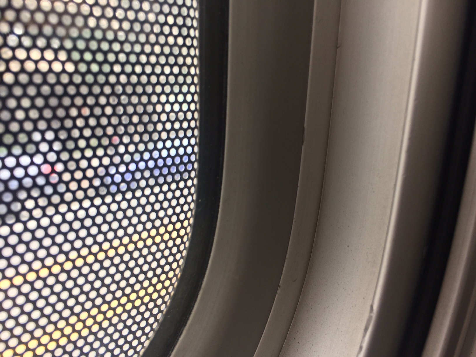
A few days after reading about James Rosenquist’s death I found myself on the wrong side of a Muni bus headed to my studio in the southern part of the city. I say wrong side because it was the slightly dim, colorless side of the bus where not only the bus, but also the windows are wrapped by advertising.
Staring out the window, I felt like I had crossed a new and disturbing threshold in the corporate media drenched culture. I was no longer outside in the “real” world looking at (or trying to avoid looking at) the advertisements. I was now stuck inside a giant rolling advertisement trying to look at the world. Instead my view was obscured by so many grey Ben-Day dots, it was hard to know what I was looking at. A sad day for daydreaming through the bus window. A sad day for the ad-free commons. But maybe a good day for artists. . .
At least viewed this way, the ad loses its intended meaning and creates (quite literally) a window through which to view the granularity of the world. A good reminder that things are not always as they appear to be. A truth we all need to be reminded of. This teachable moment brought to you by Roy Lichtenstein via Clear Channel Advertising and SF MUNI.
For now however, I'm sticking with the view espoused by Carolyn Caldwell and RJ Rushmore and their Art in Ad places campaign. Its time to take back these public spaces and beautify them with art and something drawn by the hand. Until we get real policies in place to protect the ad-free visual commons, these guerrilla tactics will have to multiply.
Noel'le Longhaul, Absence. Photo by Luna Park. Courtesy of Art in Ad Places.


